Posts

Reference Map of South America

Image
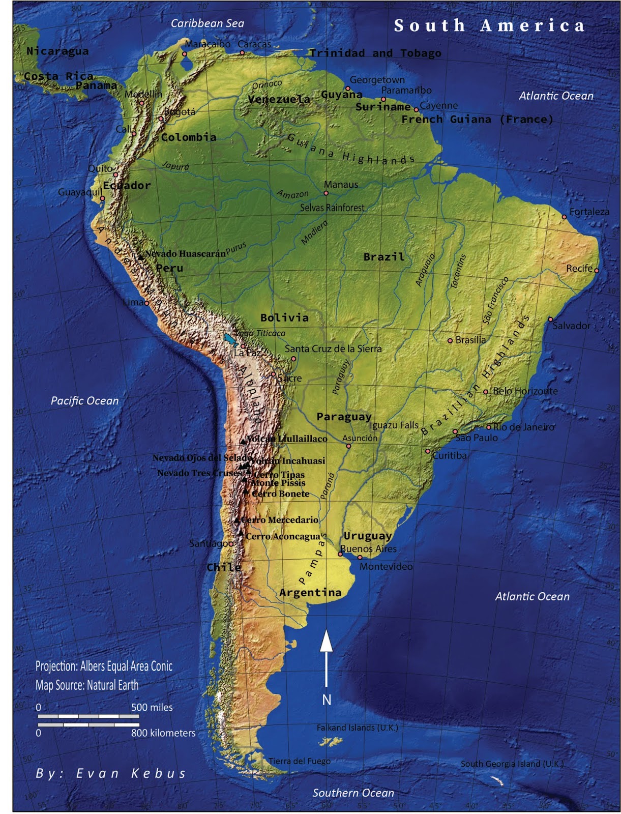
Summary: This is a  reference map of South America that I created which includes countries, specific cities, rivers, mountain ranges, volcanoes, mountains and the oceans. I was tasked with including all these features and to create an aesthetically pleasing and accurate map of South America while doing so. The purpose of this assignment was to increase my familiarity with Adobe Illustrator CC as well as applying the five essentials of map design (legibility, figure-ground, clarity, visual hierarchy and balance). I was also tasked with including elements of map design such as title, legend, scale, data information, graticule, neat line, labels and other key elements. The entirety of this map was created in  Adobe Illustrator CC and through this process I learned how to organize and work with layers while adjusting properties of the map. Learning how to lock, unlock and select elements of the map to edit is an essential function of this program. I was able to edit font sizes an

Bathymetric Map of Lake Monona

Image
Summary: This map is a bathymetric map of Lake Monona in Madison, Wisconsin. It is divided into ten foot intervals from zero to seventy feet. The base map  was taken from the Wisconsin Department of Natural Resources website. After downloading it I traced over the contour lines with the pen tool in Adobe Illustrator and created a different layer for each interval. After completing all elevation levels I went into color Brewer and picked an appropriate color scheme which provided me with eight shades of blue. I chose to go from a lighter shade to a darker shade for the shallowest area leading into the deepest since this is usually how bathymetric maps are colored. On some parts of my contour lines I traced over existing lines with the smoothing tool to make a more aesthetically pleasing map. Finally, I created a legend for my depth intervals and added a title and my name. Since the base map I used already had a north arrow and scale I decided to keep these along with the streets

Madison Lake Shoreline Analysis

Image
Madison Shoreline Changes 1937-2017 By: Evan Kebus Introduction: This is a study of shoreline changes on Lake Mendota and Lake Monona over the past 80 years. Living in Madison all my life and constantly fishing and boating on Lake Mendota and Lake Monona drove me to peruse this project. After the flash floods in August-September 2018 my curiosity grew about why the flooding was so severe and how the shoreline of the Madison Lakes had changed over time. This is an analysis of the shorelines of two lakes in Madison, Wisconsin. One map is a mosaic of aerial images from a biplane taken in 1937. The other is an orthographic satellite image taken in 2017. These maps will be used to compare and analyze any major changes along the shoreline. 1937 2017 Overview: Lake Mendota is the larger northern lake and Lake Monona is the smaller southern lake. The Yahara River connects these two bodies of water and runs through the city of Madison, Wisconsin which resides on the isthmus. Sho

Trail Loop Map

Image
Summary:  This map was created by using a GPS to collect data points as August Guenther and I walked through the woods on University of Wisconsin Eau Claire. We set the GPS to record a data point for every meter that we walked. With these data points we were able to make this trail map with a reference to the campus. We added a base orthographic map to give reference to the river and the campus. We then added callouts for points of interest along the way. Overall the hiking trail was a loop which began and ended at the bottom of the hill on the lower section of campus. We also indicated that there was a trail that you could take that would lead you to upper campus instead of completing the loop. The loop itself was 1.26 miles and has many points of interest including areas of river access and an area with a bench if you need to rest along the way. This map was created by uploading data points into ArcMap and adding a base map from ArcGISOnline. We included a scale bar, a north ar

Wisconsin Counties Traffic Fatality Data

Wisconsin Counties Traffic Fatality Data By: Evan Kebus Summary: This interactive google map is illustrating how many traffic fatalities occur per capita in each Wisconsin county based on 2017 population statistics. It shows that areas with lower populations have higher fatalities per capita even though most of the time they have less total accidents that most of the bigger counties in Wisconsin. This is  because each person represents a higher percentage of the counties' population in smaller counties. This interactive map allows you to click on a county and see a lot of important traffic fatality related statistics such as the total fatalities, the population of the county as of 2017 and also the fatalities per capita which is the main focus of this map. The data was classified in increments of 4 fatalities per capita. It started at 0.65 because that was the minimum value, this value came from Ashland county with a population of 15,500 and 1 traffic fatality. 17.